Amazing amazing tribute to one of the best animated movie and the best 2d animation movie of all time.


I love it all. =)

 Thanks: 0


Amazing amazing tribute to one of the best animated movie and the best 2d animation movie of all time.
I love it all. =)


Sorry for the delay!
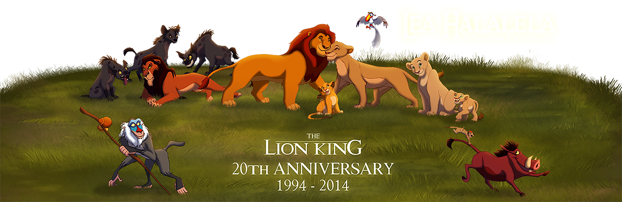
Here is a suggestion for the theme header:
I made 400px tall and the same proportions as the Lion Guard header. Hope it gives you something to work with, at least
http://www.bornfree.org.uk/ | http://www.wildlifenow.com/
-----
Lea members I've had the pleasure of meeting in person:
Shadow, This Land, King Simba, Daniel, Lion King Stu, Amaryllis, Safila,
Sharifu, Sadiki, Taneli, Leorgathar, Nathalie and Lucy!
Ah Nicely done Kanu, so we're getting another green theme? It's been a while since I used Hakuna Matata theme.

Oooh, yes, can it be green?! Please oh please can it be green?!
That which you manifest is before you.

Sorry it's taken me awhile to get back to you.Originally Posted by KanuTGL

(I was looking at the header on Monday while I was at work but then got pulled away.)
The header looks good and I think I can definitely work with it. I'd sort of had in mind a header that took the entire screen width on a 1080p screen, but honestly it doesn't matter as long as it's used and a new theme materializes.I'll start working on the color scheme and perhaps new icons if it's warranted, but then I'll need to get Sadiki to upload the image assets. Expect something soon.
Thanks so much for doing that.
Yeah, I know you mentioned that, but not everyone has that large a screen, so I wanted them to be able to see the entire header too, hehe. Unless the theme will be responsive of course, in which case I could see if I could make it work for that kind of resolution. I'm not quite sure if I could though without changing the composition a lot/creating a lot more work for myself... I did try to crop the image as-is for 1920x400px, but it didn't look great
Anyway, I'm glad this is something you can work with, and I look forward to seeing the theme
http://www.bornfree.org.uk/ | http://www.wildlifenow.com/
-----
Lea members I've had the pleasure of meeting in person:
Shadow, This Land, King Simba, Daniel, Lion King Stu, Amaryllis, Safila,
Sharifu, Sadiki, Taneli, Leorgathar, Nathalie and Lucy!
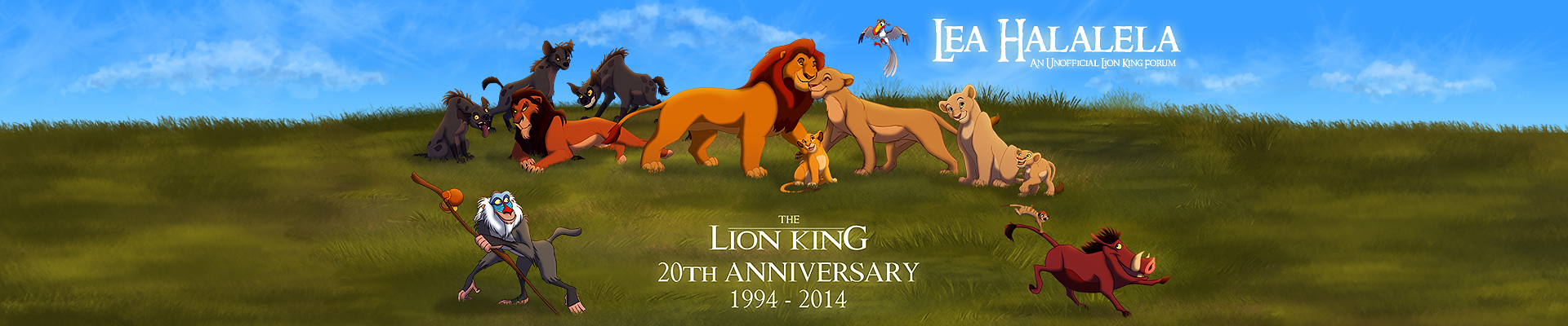
Actually, my idea original behind the header was that even if it were cut off on the sides due to the window being narrower than 1920px, the title and other text would still be centered and visible on the screen, as would have been the case with my draft header:
Even so, it's not a big deal either way. I'm going to be pretty busy this week, so I'm not sure when I'll have a new theme done. Currently, I'm playing with just modifying the Lion Guard theme slightly, with a darker color pallete. If there's a need, we can revisit the header resolution later.
The new Lion Guard theme is now live. You can select it with the style chooser popup menu on the bottom left corner of every page.
You guys wanted more green, and a 20th anniversary theme, so hopefully both have been delivered. I couldn't find one color that integrated the title image and the navbar seamlessly, so I just went with a little color variation, and a semi-transparent sort of leaf pattern that I ended up extending to most headers.
The icons are the same from the Lion Guard theme. It's important to note that I've been meaning to upload some new icons that would affect both this and the Lion Guard theme, as some of the current icons are a bit wonky or simply weren't updated from the default Lea icon set. Somehow during re-arranging stuff in my room, the flash drive those updates were on was misplaced. I'll either upload them when I find the drive or just redo them when I have time.
If you guys have any suggestions for improvement, let me know.
I can change the default Lea theme so new members or people who haven't changed their default theme will see it automatically, but I want to be sure that's something you guys would want.
EDIT: The title image might not appear centered currently, but I'm working on the issue.
EDIT 2: The title image should now be centered on all browsers, including Internet Explorer. (Same should be the case with other themes.)
Additionally, I know there was some concern about our artwork being used elsewhere, so I added some text in the page footer (this theme only):
The title image is a collaboration between members of this forum, assembled by our very own KanuTGL. Please do not use elsewhere without our express permission. This site is a not-for-profit fan project and no copyright infringement is intended. Please contact the webmaster in the event something seems amiss.
Last edited by Vidan; August 29th, 2014 at 04:43 AM.

Looks impressive.
But I do think this looks good, good job Vidan. I like the green theme.
Thank you to the talented KanuTGL for my avatar!
My Lion King Fan-Art

Yes, that's great work!
The colors look nice and I really like the banner.
The only thing I noticed is that the activity stream (http://www.leahalalela.net/activity.php) looks a bit off, when profile pictures are too big. I don't know if it's just my browser. I didn't have the time to check other browsers than firefox yet. It looks okay on the default red Lea style, so I guess it must be something with the settings. Probably the style variables for the activity stream. But then again, I could be wrong. Just my first guess.
I also see the two "blue" bars, like Sharifu. We could solve this by adding a repeating background with a slithly green and blue touch behind the actual banner. It would look a little bit off, beacause we can hardly make it fit the grass' color. But I think it might look a little bit nicer than the two blue bars. What do you think?
Other than that, awesome work, Vidan!
Edit: and maybe you could change the font in the editor to match the style? I mean the font when I'm writing a posting.
Edit 2: And about the little disclaimer: Good thinking! The only thing is that sendmessage.php is missing the "www" before "leahalalela.net". The link works, but if you use the domain without the www the user will get a different cookie and therefor not stay logged in. That might confuse people. So it's best to use the www for the URL
"Respect the past; you never know how it may affect you."
~ Brom, "Eragon".
Thank you for that nice Avatar, Atimon.
Neat! I really like the little leaf pattern on the 20th Anniversary theme
But, yeah, the header doesn't transition very nicely, haha. I still doubt I could crop it to 1920px width without having to rearrange the group (which I don't really feel like doing), but I might see if I can patch up the grass to be wider, or if not that, at least make the transition between the image and the backgrond a little smoother... Watch this space.
Edit:
Here's your big massive 1920px header
Last edited by KanuTGL; August 29th, 2014 at 10:09 AM.
http://www.bornfree.org.uk/ | http://www.wildlifenow.com/
-----
Lea members I've had the pleasure of meeting in person:
Shadow, This Land, King Simba, Daniel, Lion King Stu, Amaryllis, Safila,
Sharifu, Sadiki, Taneli, Leorgathar, Nathalie and Lucy!
Thanks, Kanu. It looks great. Sadiki tried uploading the new image in place of the old one but there are some issues with the image not being centered correctly, even after I did what I could beforehand to ensure all titles were centered across the site. So, I'll have to work out that issue before the new title image goes live.
Kirauni, I'll look into the issues you mentioned. Thanks.
EDIT:
Fixed.
I addressed the issue of the bars. I had added a margin to the top since the top links were nearly flush with the "Lea Halalela" title text, which is where the blue bars were coming from. I could do something like you described eventually if we feel like the links need a bit more space, but for now I'll leave good enough alone.
I'd have to dig through the templates to change the font exactly, as it doesn't seem to reflect the associated style variable, but at least it's a sans-serif font now. This change is also reflected in the Lion Guard theme.
Fixed.
EDIT 2:
Another technical note: due to the nature of the method I used to center the title image regardless of window width, the clickable area to take you back "Home" will most likely be smaller than the window width. Currently it's 800px wide. If I made it wider that might affect rendering of the page for those viewing the page at a low resolution or a smaller window.
Last edited by Vidan; August 30th, 2014 at 12:01 AM.

I'm currently using the 20th Anniversary theme. It looks great!
Lea members I've had the pleasure of meeting in person: Sharifu, Sadiki, This Land, Nathalie, Lucy, Lion King Stu, Taneli, KanuTGL, Shadow, Revo and Leorgathar
Twitter / deviantArt / Facebook
Yes, I'm using too. It's really awesome looking.
Thank you to the talented KanuTGL for my avatar!
My Lion King Fan-Art
I'm using the 20th Anniversary theme, It look great and such. But for me it took me a while to get use with the color scheme of the forum. Right now I used to it YAY. \o/
Yes, great work on those fixes, too. Thanks, Vidan!
"Respect the past; you never know how it may affect you."
~ Brom, "Eragon".
Thank you for that nice Avatar, Atimon.
Does anyone have any objection to me making it the default theme for the site? We might as well embrace a new decade, even if it's almost half over.(If you've selected something other than the current default, you'd still see your selected theme on your computer/device until you pick something else.)
I don't have an objection to that, I like that idea.
Thank you to the talented KanuTGL for my avatar!
My Lion King Fan-Art

I have no objection to that either.
Now... what else can we make themes for?
We are so much more complicated than our names.
*Team Night Sky*
Por favor, manténgase alejado de mi chocolate.
If you're not here to party, get out of the teacup.
I have no objection, count me in. I think the vote going to be like 100% in no time.
 Posting Permissions